Business leaders across the world recognize the value that data visualization brings to their enterprises. Presently, around 60% of companies globally use data and analytics to improve processes and cost efficiency. Even though companies collect and analyze data, there is confusion about how to extract and apply insights from the data.
One strategy that easily goes overlooked is transforming the data into visual representations known as data visualizations. These visualizations come in many styles including graphs, charts, and diagrams. Representing the data in these visual forms offers a variety of benefits, the most important of which is improved decision-making.
This guide will help with understanding the value of visualizing data. Let’s explore the impact of this strategy as well as some example use cases that may be relevant to your business.
How Businesses Can Make Better Decisions with Data Visualization
Making the right decisions at the right times is the key to success for any company. Of course, doing so is easier said than done. Businesses are using data visualizations to improve their decision-making processes and lead to better outcomes over time. So how do these visualizations improve business decision-making?
Many companies today collect massive amounts of data. They collect everything from internal data about sales figures, expenses, and customer behavior to external data such as economic indicators, social media information, and government data. In their raw form, however, these large volumes of data don’t help business leaders make better decisions for their companies. It’s all about finding insights hidden within the data and that’s what visualizations are for.
Just by quickly looking at a simple visualization like a line graph, team members often discover valuable insights they wouldn’t have otherwise noticed. Visualizations present data in an engaging, accessible manner which reduces how long it takes to analyze data sets. As a result, faster analysis means faster, more accurate decision-making in critical periods. The time saved by using data visualizations could ensure you don’t lose out on an opportunity or let competitors pull ahead.
5 Examples of Data Visualizations
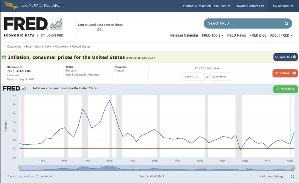
1. Inflation in the United States – Source: St. Louis Fed
This fairly simple data visualization shows the annual rate of inflation on consumer prices in the United States over the last 60 years. At a glance, you can immediately see peaks and valleys in annual inflation without having to pore over spreadsheets and look at each data point. This graph is effective because it conveys information about US inflation in a simple, understandable way that anyone can engage with. If asked whether inflation was relatively high or low in 1975, someone looking at this graph could confidently answer the question right away.
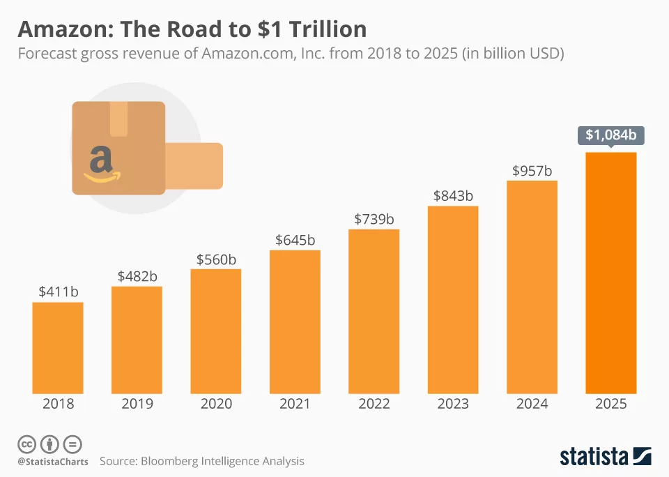
2. Amazon’s Forecasted Gross Revenue – Source: Statista
You don’t have to limit visualizations to historical data — they are also used to showcase data forecasts about future outcomes. In this case, the visualization represents Amazon’s projected gross revenue each year from 2018 up to 2025. The simple bar graph shows that Amazon is projected to cross $1 trillion in revenue by 2025. This is more than double its gross revenue in 2018. Companies use these types of visualizations of forecast data to support their strategies for the future.
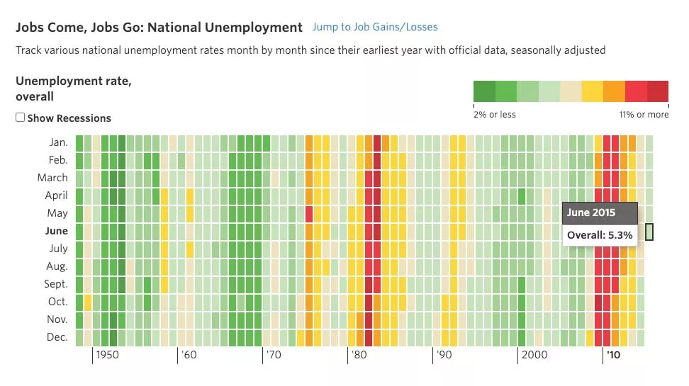
3. National Unemployment Rate – Source: Wall Street Journal
In this colorful visualization, you can see the national unemployment year each month from 1948 to 2015. As the key at the top right shows, green rectangles indicate relatively low unemployment rates while yellow, orange, or red rectangles show periods of relatively high national unemployment. This visualization displays an incredible amount of data in a very convenient way. Within seconds, you can see the years and months during which unemployment was a larger concern — just by picking up on color differences.
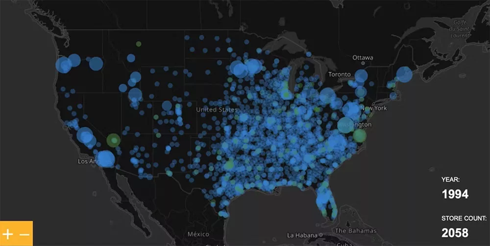
4. Walmart Stores Across the Country – Source: Flowing Data
This data visualization depicts the growth of Walmart over time. The photo shows the number of Walmart stores each year represented as blue dots, in its location on the map. Over time, this visualization will change showing how Walmart spread across the United States and has grown to be such a powerhouse in the retail space.
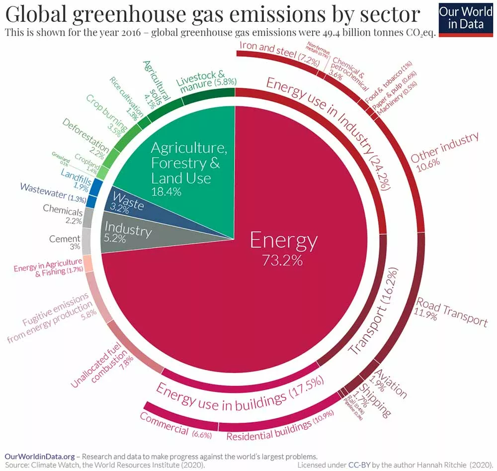
5. Global Greenhouse Gas Emissions by Sector – Source: Our World in Data
In this more detailed pie chart visualization, you can see a breakdown of global greenhouse gas emissions by sector of the economy. It’s immediately clear from this visualization that the energy sector accounts for the largest percentage of greenhouse gas emissions, followed by agriculture, forestry, and land use. This style of visualization is used in many ways with business data. You could take your sales data, for example, and create a similar in-depth pie chart depicting your products/service offerings as a percentage of your total annual revenue. These are the kinds of charts that convey complex, detailed data in a way that everyone can meaningfully engage with and use to find valuable business insights.
Get More from Your Data with an Operational Analytics Platform
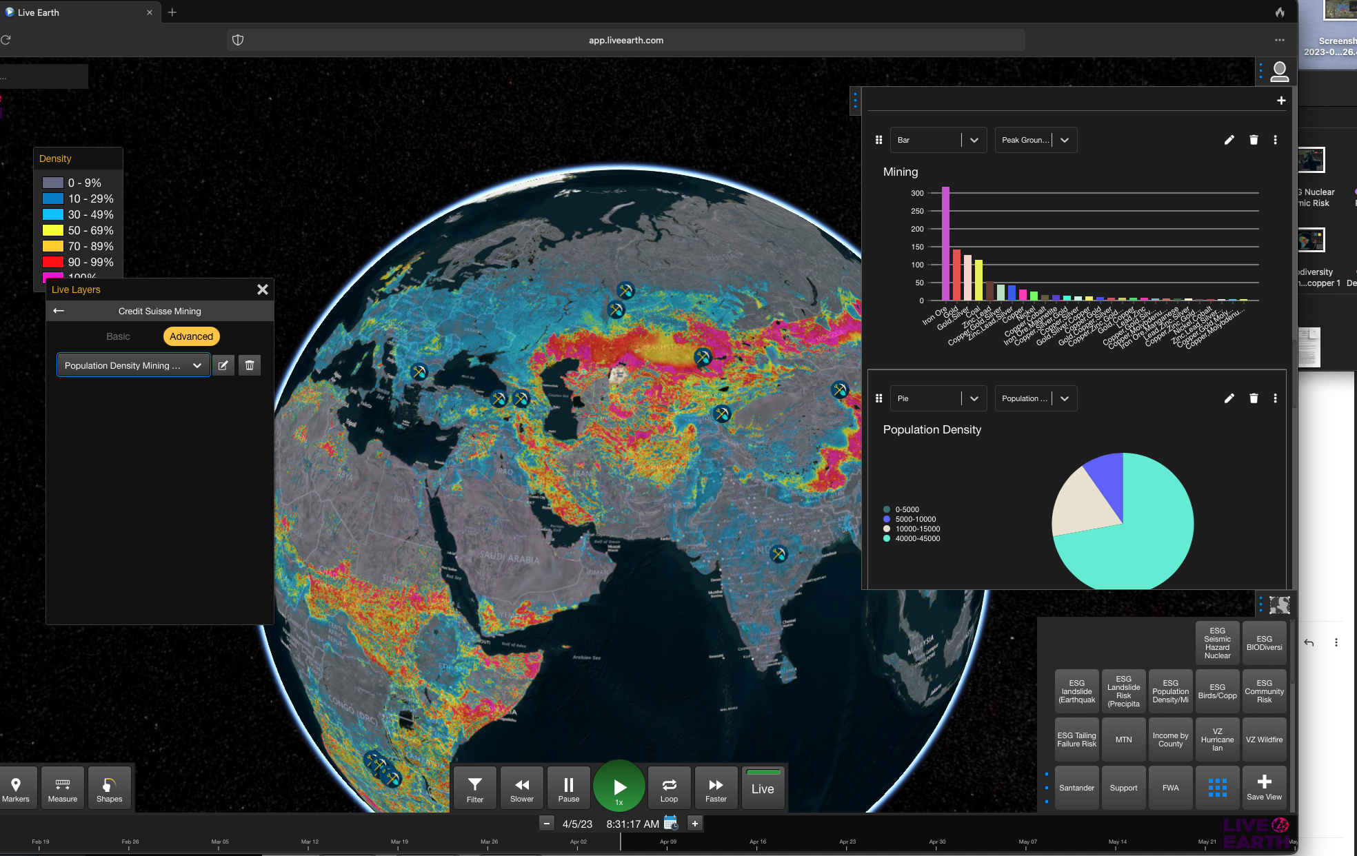
Business leaders should always strive to improve decision-making within their enterprises. Having access to additional actionable insights leads to better decisions which, in turn, leads to greater success for the company. You can gain unprecedented access to those valuable insights with a data visualization and analysis tool like Live Earth.
Live Earth is an innovative operational analytics platform that helps enterprises transform their decision-making. Using your business data and an unmatched real-world data set, Live Earth creates visualizations that convey deeper actionable insights. You can contextualize your data and find hidden opportunities that would have slipped through the cracks otherwise. Even better, Live Earth allows you to view and analyze your data in real time. You won’t have to worry about delayed decision-making and missed opportunities when you use the platform. Schedule your custom demo to visualize the ways that data can take your business to the next level.