
Every day, healthcare companies collect and analyze an incomprehensible amount of data. Experts estimate that the healthcare industry generates around 30% of the data in the world, and the volume of data generated by the industry is still growing exponentially. But what do healthcare companies do with all of this data they’re collecting?
The goal of collecting this data is to discover actionable insights that enhance patient care, drive productivity gains, and ultimately increase profits. There’s a large jump between collecting data and actually putting it to good use, though. So first, these companies must tackle some of the major data challenges in the healthcare industry.
Major Data Challenges for Healthcare Companies
To effectively leverage healthcare data, companies have to address key challenges such as:
1. Data Silos
Often, healthcare organizations use a variety of systems to collect and store their data. Without the right processes in place, this data can then become siloed—kept separate from other data and only accessible only to a single department or business group. Data silos prevent organizations from using their data to the fullest extent. They can see the whole picture only by breaking down these silos and integrating data.
2. Security Issues
Healthcare data is generally highly sensitive and subject to a variety of data security regulations, such as HIPAA. In addition, cybercriminals specifically target healthcare organizations with ransomware and other attacks to compromise this data, so proper security measures are essential. Failing to protect your healthcare data can lead to very costly breaches and irreparable damage to customer trust.
3. Inaccessibility
Consider how many people within your organization would say they can confidently analyze healthcare data and find insights. It’s likely not very many, and that’s normal. Despite the growing emphasis on data collection and analysis, many companies still limit data analysis to dedicated experts. As a result, the majority of the company is left on the outside when it comes to interacting with and using your data.
When most of your team members cannot engage with your data, you’re missing out on valuable perspectives and analysis. That’s why there’s such a push toward data democratization—the process of making data and analysis accessible to everyone in an organization.
Data Visualization Examples in Healthcare
Tackling all these challenges is a complicated process, but one tool that makes a huge difference is data visualization. Data visualization is the process of converting data sets into visual forms like graphs, charts, and maps to display the information.
In the healthcare field, data visualizations help organizations take the massive data sets they collect and turn them into something more useful. Today, every healthcare company can benefit from using data visualizations as part of its analysis efforts.
Healthcare data is incredibly varied, so it’s no surprise that there are many different types of data visualizations. Here are some of the top data visualization examples for healthcare data:
1. Infographics
Source: Centers for Disease Control
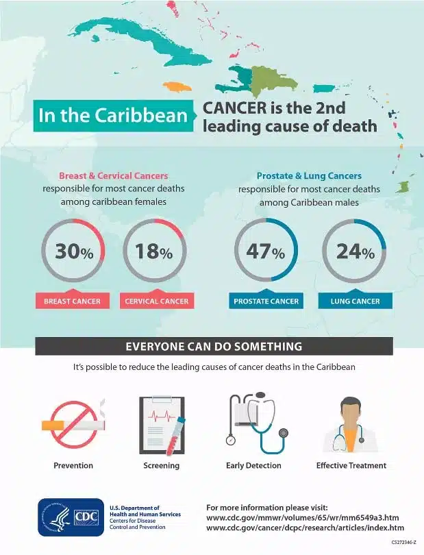
If you want to convey complex data to the public (as healthcare companies often do), infographics are the perfect way to do so. These images contain text and graphics that highlight the most important information from a data set. They may include charts, statistics, and other key details that help viewers engage with the content.
For example, the infographic above informs viewers about cancer in the Caribbean. At a glance, anyone can see that breast cancer causes 30% of cancer deaths among Caribbean females and other relevant statistics. The average person wouldn’t be able to quickly pull out those details while looking at the raw data instead. That’s the value of creating and sharing infographics: they make complex data easy to understand.
Healthcare companies can use infographics internally and with the broader public. Within the organization, share infographics to engage your team members during presentations or while conveying internal reports. Share infographics with people outside of your organization to get the public interested in your findings.
2. Interactive Dashboards
Source: World Health Organization
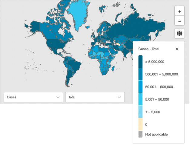
Sometimes, a static graphic isn’t enough to fully convey the information contained in your complex data sets. In that case, interactive dashboards may be the ideal data visualization solution.
Interactive dashboards generally include several different data visualizations representing a complex data set. The viewer can click on different parts of the graphics and make adjustments to view the data in greater detail. This interactive component only makes the visualizations even more engaging for the viewer. If they have any areas of interest in the data, they can dive into them and learn more.
During the COVID-19 pandemic, several organizations released interactive dashboards showcasing data on the pandemic. The dashboard shown above is just one example created by the World Health Organization. In the dashboard, viewers can adjust details like whether they’re looking at weekly or daily data and cases or deaths due to COVID-19.
3. Interactive Apps and Widgets
Source: Centers for Disease Control and Prevention
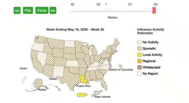
Like interactive dashboards, interactive apps and widgets are another popular form of healthcare data visualizations. These tools take the engaging interactivity of dashboards and make them available on mobile devices or other websites.
For example, the CDC offers a variety of interactive health data widgets that anyone can download and embed on their website. Then, viewers on the site can interact with the widget and learn more about the data it displays. Rather than using pre-made widgets like these, though, healthcare companies may choose to create their own data visualization widgets or apps. Offering digital apps that allow patients to view their own medical data through interactive visualizations is becoming more popular with healthcare providers.
Healthcare data visualization plays a crucial role in simplifying complex datasets, making it easier for healthcare professionals to derive actionable insights. Here are some more compelling examples of how data visualization is being used in the healthcare sector:
- Patient Health Tracking Dashboards: These dashboards aggregate data from various sources, including electronic health records (EHRs), wearable devices, and patient-reported outcomes. They visually display a patient’s health status over time, highlighting trends in vital signs, medication adherence, and recovery progress. This allows doctors and patients to monitor health metrics closely and adjust treatment plans as needed.
- Epidemiological Maps for Disease Surveillance: Tools like GIS (Geographic Information Systems) mapping are used to track the spread of diseases across different regions and demographics. During the COVID-19 pandemic, interactive maps provided real-time updates on case numbers, hotspots, and vaccination rates, helping public health officials and the public understand the spread and impact of the virus.
- Operational Efficiency Heatmaps: Hospitals and clinics use heatmaps to visualize areas of high demand within their facilities. These visualizations can show patient flow, wait times, and staff allocation, helping administrators identify bottlenecks and improve operational efficiency.
- Clinical Trial Data Visualizations: Researchers use visualizations to analyze and present the results of clinical trials. Complex data on patient demographics, treatment efficacy, and side effects are made accessible through charts and graphs, facilitating easier interpretation of results and decision-making about the safety and effectiveness of new treatments.
- Health Risk Assessment Tools: Interactive tools and dashboards assess individual or population health risks based on various factors, including genetics, lifestyle, and environmental exposures. By visualizing these risks, healthcare providers can offer personalized advice and interventions to mitigate potential health issues.
- Social Determinants of Health (SDOH) Visualizations: Visualizing data related to social determinants—such as income, education, and housing—helps healthcare organizations identify and address disparities in health outcomes. Maps and charts can reveal geographic areas and populations at higher risk, guiding targeted interventions.
- Resource Allocation Models: During public health emergencies, data visualizations can help decision-makers allocate resources more effectively. Models that visualize the demand for hospital beds, ventilators, and other resources can guide policy and ensure that healthcare facilities are prepared to meet community needs.
These examples illustrate the power of healthcare data visualization in enhancing patient care, improving operational efficiency, and informing public health strategies. As technology advances, the scope and impact of these visualizations are expected to grow, offering even more insights into healthcare management and patient outcomes.
Future of AI and Real-Time Technologies in Healthcare Data Visualization
The future of healthcare data visualization is shaping up to be very exciting. The integration of artificial intelligence (AI) and machine learning is set to transform the way we analyze and interpret healthcare data. AI-powered analytics can automate complex data analysis, reveal hidden patterns, and predict health outcomes with remarkable precision. This will enhance patient care and operational efficiency. Additionally, there is a growing trend towards real-time visualization technologies, which will allow healthcare providers and patients to access and act on data insights instantly. This shift towards immediate data interpretation will lead to quicker decision-making processes, resulting in better health outcomes and more responsive healthcare services. These emerging trends in healthcare data visualization promise to transform large amounts of data into actionable, personalized insights, revolutionizing patient care and the healthcare industry at large.
Ready to use Data Visualizations in your Healthcare Enterprise?
Data visualizations are powerful tools for any company collecting and analyzing data—especially one in the healthcare industry. These visualizations transform dry, inaccessible data sets into engaging and understandable graphics. Use visualizations to get a better handle on your data, thus improving the patient experience and internal operations. Not sure where to start? Contact Live Earth to speak to our data experts and learn more about the power of data visualizations in healthcare.