It’s incredibly difficult to gain any valuable insights from looking at large amounts of raw data alone. Once translated into a visual context, however, that raw data becomes much easier for decision-makers to understand and use effectively.
Data visualization is the process of making that transformation. The graphics used to represent the data can include charts, graphs, maps, or animation — any visual representation that makes noticing trends and outliers in the data simpler.
While you can create visualizations for any data set, it’s essential for analyzing massive data sets such as those collected by major enterprises.
How Big Data and Data Visualization Work Together
With the rise of big data, more and more companies are relying on large data sets to develop business strategies and forecast future events. They need a method to comprehend and explain those huge data sets to get the most out of them. Rather than dedicating teams to manually sort through the data and explain it to decision-makers in the organization, companies can choose to create visual representations of that data.
Visualization of big data is often more complex than standard visualization techniques like bar graphs and pie charts. To visualize big data, companies may choose more appropriate representations like fever charts and heat maps. Before an organization can even decide which visual representation to choose, though, it needs to collect the raw data.
The company collects raw data that its leaders believe may be relevant, typically from a wide variety of sources. Once collected, the data then needs to be processed. Only then can a visualization specialist transform the big data into a usable visual representation.
One of the drawbacks of using data visualization is that your organization will typically need to hire a visualization specialist. While your existing team of data specialists may be able to create some visualizations, a visualization specialist is better equipped to balance form and function for the best results. It’s not enough to simply create a graph or image related to your data sets — the best visualizations need to combine storytelling with analysis.
Types of Data Visualization
Creating a visual representation of data isn’t a new strategy, but modern technology does make it more convenient than ever. Data scientists or anyone else creating these visualizations have a variety of forms to choose from, such as:
- Stacked bar charts: Though simple, these graphs can break data down into sections and offer a very easy-to-understand visual representation of that data.
- Scatter plots: Best for showing the relationship between two variables, scatter plots can be useful alone or as part of a regression data analysis.
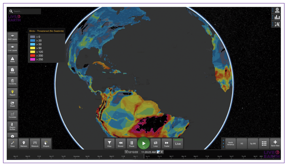
- Heat maps: Heat maps are a form of geospatial visualization that shows data values across a map in different colors. Though popular for temperature data, heat maps can also be used with other geographic data.
- Area maps: Another form of geospatial visualization, area maps show data relevant to specific states, counties, or countries on a map.
- Tree maps: Tree maps use nested rectangles to show hierarchical data.
- Histograms: Histograms show the distribution of numerical data and are a type of bar chart.
Part of getting the most out of a visual representation of a data set is choosing the right type of visualization for the data you have. Using a scatter plot when your data set is better suited to a tree map isn’t going to yield the optimal results, for example.
Data Visualization in Action
You can find examples of effective data visualization in almost every professional industry, from finance and marketing to education and government. Some potent examples include:
COVID-19 Hospitalization Rates
During the COVID-19 pandemic, medical providers and governments at every level were collecting tremendous amounts of data related to infection rates, hospitalization rates, and deaths, among other details. The Centers for Disease Control and Prevention (CDC) took the data on COVID-19-associated hospitalization rates over time and created a visual representation of it in the form of a line graph.
Looking at the graph, it’s much easier to see the trends in hospitalizations from month to month. The same data in its raw form would be of little use at all. Public health officials could use a graph like this one to adjust their strategies for dealing with the pandemic or inform
United Kingdom Exports
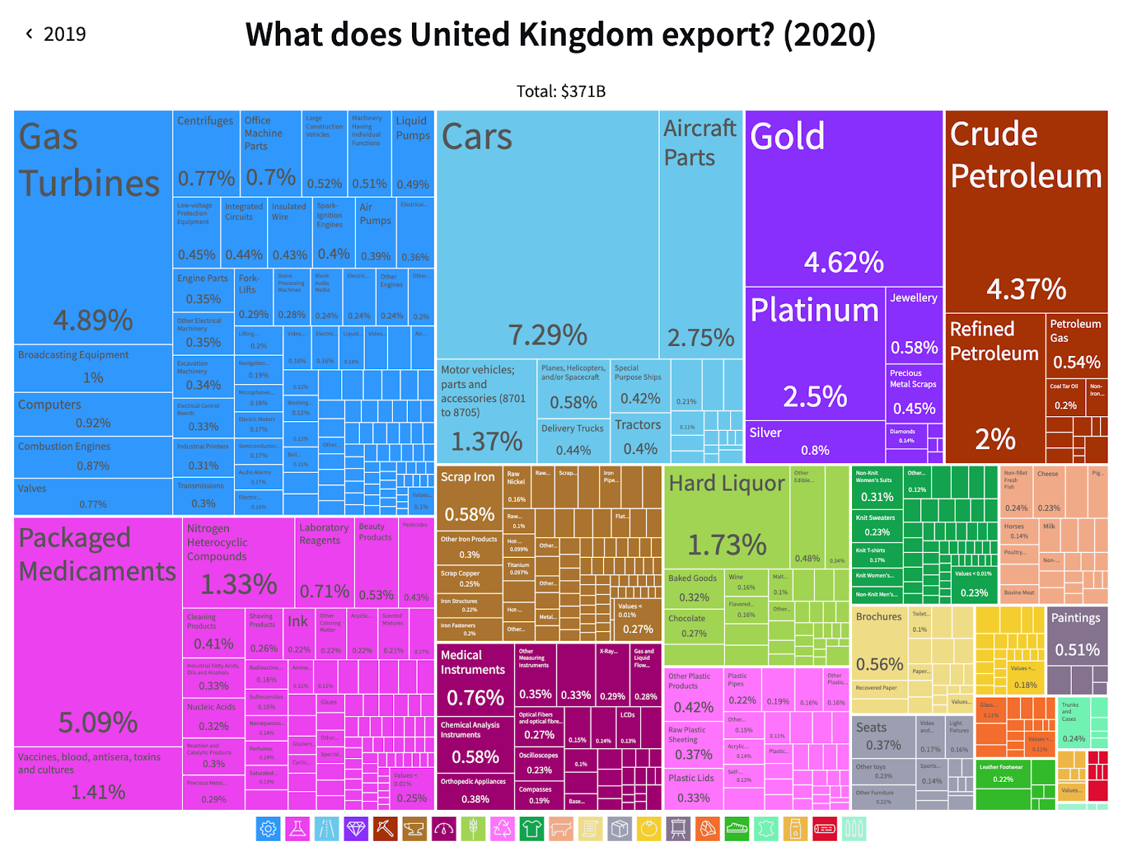
The Observatory of Economic Complexity, a site dedicated to creating visualizations of international trade data, made this model of exports from the United Kindom in 2020. Using the graph, it’s easy to determine which products the United Kingdom exported the most according to their trade value. In a spreadsheet, it would be near impossible to glean the same insights from this data.
Most Common Job in Each State
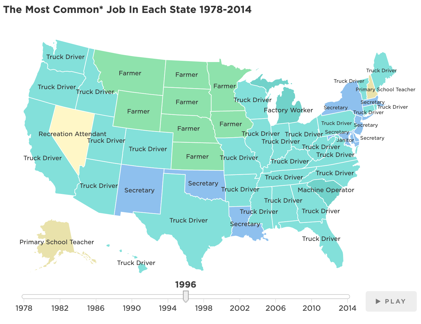
Using data from the Census Bureau, National Public Radio (NPR) put together an interactive map showing the most common jobs in each state from 1978 to 2014. It even includes a playable animation that will show the map of the United States changing from year to year to reflect changes in this data.
Without the animated map, it would be significantly more difficult to understand trends in the most common jobs in each state over time. Maps make ideal mediums for anyone looking to create a visual representation of geographic data.
All three of these examples show the power of data visualization to transform raw data from something overwhelming and hard to understand into an engaging, insightful representation. Ideally, the audiences for any visualizations should be able to quickly know what they’re looking at and begin to gain insights from them. If you find that the visualization needs extensive explaining or bores the intended audience, it probably requires editing.
Takeaways
One of the best ways to get the most out of data — including big data — is to use data visualization techniques. Utilizing data visualization will help your organization’s decision-makers understand and apply the raw data you collect to gain actionable insights. Live Earth specializes in helping you improve your business performance through data analysis and visualization. Get in touch to find out what our data streaming experts can do for you.